
samedi 19 mai 2012
Knob - Plugin JQuery pour faire des jauges en cercles
Knob - Plugin JQuery pour faire des jauges en cercles: Knob est un plugin JQuery pour faire des jauges / chargements en forme de cercles simples et efficaces.

esoTalk - Une solution de forum alternatif en PHP/MySQL open source
esoTalk - Une solution de forum alternatif en PHP/MySQL open source: esoTalk est une plateforme de forum open source en PHP / MySQL se focalisant sur la performance et la simplicité.
How Colors Help Make Websites Successful
How Colors Help Make Websites Successful:
If this message appears to another site than 1stwebdesigner ,it has been stolen, please visit original source!
You might not realize how important colours are in web design. If a website is green, it might as well be blue; it doesn’t matter. And while I thought this myself for a long time, I recently came to the conclusion that the color is actually going to make a huge difference and express something different to your audience. There are psychological effects behind each color and tone, therefore I decided to tell you more about them today.
Human senses get excited about lots of stuff. One of the most effective ways to excite somebody is to project a red hue color onto the walls of their room. It’s been done before by scientists and they came with a clear conclusion. A person who lives in a red room has a higher heart rate and blood pressure than a person living in a blue room. This is because red symbolizes excitement, we all know this. There is a reason why fast food companies choose red as their main or secondary color. Good examples are Coca-Cola, McDonald’s, Burger King or Pepsi (although blue is their main color).

Image Source: StockLogos
There’s more to colors in web design than just the emotional factor. People tend to gamble more under red light conditions than under blue light. This is the main reason behind cities like Las Vegas using a lot of red lights. Colors have impact on performance. Red lights make people act quicker and feel more powerful, which is not always beneficial, while blue makes people think more before acting. There is a reason STOP signs are red – you need to act right away and stop the vehicle you drive, otherwise you are in danger.
There is a very good trick behind using complementary colors together. Drawing a thin neutral white, gray or black line around the two colored shapes will make the eyes see both colors separately. Just look at the Pepsi logo below: red and blue are separated by not only a thin layer of white, but by a quite big one. This white shape blends red and blue better then if they would be placed right on top of each other.

Image source: Pepsi
And while huge corporations usually hire experts to do this research for them, the results are not always good. Every designer (and every person in general) has a tendency to like colors or combinations of colors and to use them in different situations because it’s what they personally like. I myself love red and black together, pretty obviously because I’ve been supporting Italian outfit A.C. Milan for almost ten years now. This is not such a good asset when working with colors is your way of earning a salary. It is crucially important for designers to tear all their personal favorites apart and only focus on the clients and their needs.

Image source: 123RF Stock Photos
According to different sources, half of the people visiting a website don’t come back because of the color of the design. The first thing people need to recognize when they see your site are the brand colors. If you have multiple colors and they can’t see the most dominant, it means you should consider a redesign.


Image source: Website Templates Online
If this message appears to another site than 1stwebdesigner ,it has been stolen, please visit original source!
You might not realize how important colours are in web design. If a website is green, it might as well be blue; it doesn’t matter. And while I thought this myself for a long time, I recently came to the conclusion that the color is actually going to make a huge difference and express something different to your audience. There are psychological effects behind each color and tone, therefore I decided to tell you more about them today.
Human senses get excited about lots of stuff. One of the most effective ways to excite somebody is to project a red hue color onto the walls of their room. It’s been done before by scientists and they came with a clear conclusion. A person who lives in a red room has a higher heart rate and blood pressure than a person living in a blue room. This is because red symbolizes excitement, we all know this. There is a reason why fast food companies choose red as their main or secondary color. Good examples are Coca-Cola, McDonald’s, Burger King or Pepsi (although blue is their main color).
Colors Stimulate Senses
Colors can stimulate and excite people, increase their appetite, make them feel warm or make them feel tranquil. Red simply makes you excited according to those who study chromodynamics. Coke’s website is red – it gives you a feel of a lazy, hot summer day – just when you feel the need to drink Coke.Image Source: StockLogos
There’s more to colors in web design than just the emotional factor. People tend to gamble more under red light conditions than under blue light. This is the main reason behind cities like Las Vegas using a lot of red lights. Colors have impact on performance. Red lights make people act quicker and feel more powerful, which is not always beneficial, while blue makes people think more before acting. There is a reason STOP signs are red – you need to act right away and stop the vehicle you drive, otherwise you are in danger.
Mixing Colors
Mixing colors is beneficial if done the right way. Mixing very complementary colors is also something people do, but it should only be done occasionally. It shouldn’t be overdone because it has a bad effect on people’s eyes. You can think of a black website with pink text. Now that’s an image I would like to get out of my head as soon as possible :).There is a very good trick behind using complementary colors together. Drawing a thin neutral white, gray or black line around the two colored shapes will make the eyes see both colors separately. Just look at the Pepsi logo below: red and blue are separated by not only a thin layer of white, but by a quite big one. This white shape blends red and blue better then if they would be placed right on top of each other.
Image source: Pepsi
Colors and Cultures
Moreover, colors mean something else in different parts of the world. While red means luck in China, it means a lack of it in Germany. Huge corporations with lots of financial resources will use large amounts of money to study the effects different colors have on different cultures, before entering a new market. Many think it is impossible, but clients can be lost because of using the wrong colors.And while huge corporations usually hire experts to do this research for them, the results are not always good. Every designer (and every person in general) has a tendency to like colors or combinations of colors and to use them in different situations because it’s what they personally like. I myself love red and black together, pretty obviously because I’ve been supporting Italian outfit A.C. Milan for almost ten years now. This is not such a good asset when working with colors is your way of earning a salary. It is crucially important for designers to tear all their personal favorites apart and only focus on the clients and their needs.
Colors for a Website
Picking a color for a website means much more then picking your favorite color and turning it into a layout. It means picking the right color in order to get the desired response from your audience. If you know your audience well and figured out which color works best for them, you are already halfway there in the creation process. It is also quite unlikely to pick a color that will fit every visitor of your website, therefore it is even more important to be able to determine which color and tone works best for most users you target.Image source: 123RF Stock Photos
According to different sources, half of the people visiting a website don’t come back because of the color of the design. The first thing people need to recognize when they see your site are the brand colors. If you have multiple colors and they can’t see the most dominant, it means you should consider a redesign.
- If you have a blue color scheme, people will likely give you a better response when in a good mood. If you want a clean, white design, it’s fine too. But if you want to make it exciting, use bright red or orange here and there. White and green work great together, and if you want to be stylish and modern without using intense colors, go for white and gray. Such a combination illustrates something glamorous, sleek, fresh and clean. Just look at the classy example below.
- If you like darker shades, pretty much everything works well with black as long as black is not the dominant color. A website with a black background can be fancy and look good, but is not easy to read. The two simplest combinations you can go for are black and white or black and a bright gray. Although a very powerful contrast, black and orange work really well together, but might require white for balance.
- If you want to combine both black and white with a color, then they work really well with blue; make sure white is dominant, otherwise you need a very bright blue to dominate. Don’t give black a lot of emphasis in this combination. You can see a good example below. The second example is quite poor and shows how this combination can be put into practice. Not only is the design outdated, but the colors make it even more difficult to bear.
- Black and white work very well with red too, but make sure red is not dominant, as then it gets too powerful and creates an unbearable contrast with black. You can see two good examples below.
- A third combination I would recommend is black, white and green, and you can see down below why.
Image source: Website Templates Online
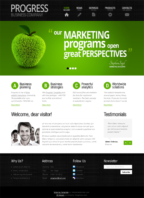
Conclusion
Using the right color in your designs is crucial and I am sure you can see why. Although it might sound wrong, by using the right color in accordance to your audience will increase the likelihood of them doing what you want them to do. But wrong or right, this is what all designers work for, sending a message to an audience and then hoping to get a response from them. If you understand how color psychology works and which color fits your audience, you are a step closer to launching a successful website.DocNow est la Start-Up française du mois d’Avril
DocNow est la Start-Up française du mois d’Avril: Après la présentation d’une start-up française chaque jeudi du mois d'avril, les grandes divinités du vote (c’est à dire les lecteurs de Presse-Citron) ont encore frappé : DocNow est sacrée start-up française du mois d'Avril.

Par conséquent, l'application gagne sa place de finaliste pour le grand vote final qui aura lieu en Juin prochain pour désigner la Start-Up Presse-Citron 2012.
Pour rappel, DocNow est une application iPhone médicale (et bientôt Android) vous permettant d’entrer la liste de vos symptômes pour savoir si une pathologie semble correspondre..
En attendant la désignation du grand vainqueur de l'année, vous pouvez relire l’article sur DocNow ou aller directement sur leur site web.
Articles sur le même sujet :

Par conséquent, l'application gagne sa place de finaliste pour le grand vote final qui aura lieu en Juin prochain pour désigner la Start-Up Presse-Citron 2012.
Pour rappel, DocNow est une application iPhone médicale (et bientôt Android) vous permettant d’entrer la liste de vos symptômes pour savoir si une pathologie semble correspondre..
En attendant la désignation du grand vainqueur de l'année, vous pouvez relire l’article sur DocNow ou aller directement sur leur site web.
Articles sur le même sujet :
- Votez pour la start-up française du mois d’Avril
C’est maintenant l’heure du vote pour les 4 start-ups présentées durant le mois d’Avril. Qui de Sharypic, DocNow, Potati ou(...) - [La Start-Up française de la Semaine] : DocNow
DocNow est une application iPhone qui va analyser vos symptômes pour vous informer sur la maladie qui semble y correspondre(...) - Cityzencar est la Start-Up française du mois de Novembre
Après la présentation d’une start-up française chaque jeudi de ce mois de novembre, les grandes divinités du vote (c’est à dire(...) - PlugnSurf est la Start-Up française du mois de Mars, catégorie Hardware
La start-up PlugnSurf a remporté le vote du mois de Mars (catégorie Hardware) & se retrouve donc propulsée au rang(...) - Votez pour la start-up française du mois de Janvier : catégorie Jeux
A vous de voter pour choisir qui entre ePawn, OneFeat, Xilabs ou Babble Planet doit gagner le titre de Start-up(...)
Sami - Un générateur de documentation PHP fraichement open sourcé
Sami - Un générateur de documentation PHP fraichement open sourcé: Sami est un générateur de documentation PHP fraîchement rendu open source, utilisé et développé par Sensio avec Symfony2.
SASS vs. LESS
SASS vs. LESS:
"Which CSS preprocessor language should I choose?" is a hot topic lately. I've been asked in person several times and an online debate has been popping up every few days it seems. It's nice that the conversation has largely turned from whether or not preprocessing is a good idea to which one language is best. Let's do this thing.
Really short answer: SASS
Slightly longer answer: SASS is better on a whole bunch of different fronts, but if you are already happy in LESS, that's cool, at least you are doing yourself a favor by preprocessing.
Much longer answer: Read on.
Winner: Nobody
So what this comes down to is: SASS has Compass and LESS does not. But it goes deeper than that. The attempts at creating a real robust project like Compass for LESS haven't succeeded because the LESS language isn't robust enough to do it properly. More on that next.
Winner: SASS
For example, Compass has a mixin called
This succinct and intelligible code:
Winner: LESS
Winner: SASS
SASS has some weirdness with scope in variables though. If you overwrite a "global" variable "locally", the global variable takes on the local value. This just feels kind of weird.
Winner: Tossup
Winner: SASS
SASS will also let you perform math on "unknown" units, making it a bit more futureproof should some new unit come along before they are able to update. LESS does not. There is some more weird differences like how SASS handles multiplying values that both have units, but it's esoteric enough to not be worth mentioning.
Winner: Narrowly SASS
Number of open issues on LESS: 392
Number of open issues on SASS: 84
Pending pull requests on LESS: 86
Pending pull requests on SASS: 3
Number of commits in the last month in LESS: 11
Number of commits in the last month in SASS: 35
None of that stuff is any definitive proof that one project is more active than the other, but the numbers do seem to always leans toward SASS. As I understand it, both of the leads work on the languages in whatever little free time they have, as they both have other major new projects they are working on.
Winner: Probably SASS
"Which CSS preprocessor language should I choose?" is a hot topic lately. I've been asked in person several times and an online debate has been popping up every few days it seems. It's nice that the conversation has largely turned from whether or not preprocessing is a good idea to which one language is best. Let's do this thing.
Really short answer: SASS
Slightly longer answer: SASS is better on a whole bunch of different fronts, but if you are already happy in LESS, that's cool, at least you are doing yourself a favor by preprocessing.
Much longer answer: Read on.
The Much Longer Answer
The Learning Curve with Ruby and Command Line and Whatever
The only learning curve is the syntax. You should use an app like CodeKit to watch and compile your authored files. You need to know jack squat about Ruby or the Command Line or whatever else. Maybe you should, but you don't have to, so it's not a factor here.Winner: Nobody
Helping with CSS3
With either language, you can write your own mixins to help with vendor prefixes. No winner there. But you know how you don't go back and update the prefixes you use on all your projects? (You don't.) You also won't update your handcrafted mixins file. (Probably.) In SASS you can use Compass, and Compass will keep itself updated, and thus the prefix situation is handled for you. Yes you'll have to keep your local preprocessor software updated and compile/push once in a while, but that's trivial and thinking-free.So what this comes down to is: SASS has Compass and LESS does not. But it goes deeper than that. The attempts at creating a real robust project like Compass for LESS haven't succeeded because the LESS language isn't robust enough to do it properly. More on that next.
Winner: SASS
Language Ability: Logic / Loops
LESS has an ability to do "guarded mixins." These are mixins that only take affectwhen a certain condition is true. Perhaps you want to set a background color based on the current text color in a module. If the text color is "pretty light" you'll probably want a dark background. If it's "pretty dark" you'll want a light background. So you have a single mixin broke into two parts with these guards that ensure that only one of them takes effect..set-bg-color (@text-color) when (lightness(@text-color) >= 50%) {
background: black;
}
.set-bg-color (@text-color) when (lightness(@text-color) < 50%) {
background: #ccc;
}.box-1 {
color: #BADA55;
.set-bg-color(#BADA55);
}.loop (@index) when (@index > 0) {
.myclass {
z-index: @index;
}
// Call itself
.loopingClass(@index - 1);
}
// Stop loop
.loopingClass (0) {}
// Outputs stuff
.loopingClass (10);For example, Compass has a mixin called
background. It's so robust, that you can pass just about whatever you want to that thing that it will output what you need. Images, gradients, and any combination of them comma-separated, and you'll get what you need (vendor prefixes and all). This succinct and intelligible code:
.bam {
  @include background(
    image-url("foo.png"),
    linear-gradient(top left, #333, #0c0),
    radial-gradient(#c00, #fff 100px)
  );
}.bam {
background: url('/foo.png'), -webkit-gradient(linear, 0% 0%, 100% 100%, color-stop(0%, #333333), color-stop(100%, #00cc00)), -webkit-gradient(radial, 50% 50%, 0, 50% 50%, 100, color-stop(0%, #cc0000), color-stop(100%, #ffffff));
background: url('/foo.png'), -webkit-linear-gradient(top left, #333333, #00cc00), -webkit-radial-gradient(#cc0000, #ffffff 100px);
background: url('/foo.png'), -moz-linear-gradient(top left, #333333, #00cc00), -moz-radial-gradient(#cc0000, #ffffff 100px);
background: url('/foo.png'), -o-linear-gradient(top left, #333333, #00cc00), -o-radial-gradient(#cc0000, #ffffff 100px);
background: url('/foo.png'), -ms-linear-gradient(top left, #333333, #00cc00), -ms-radial-gradient(#cc0000, #ffffff 100px);
background: url('/foo.png'), linear-gradient(top left, #333333, #00cc00), radial-gradient(#cc0000, #ffffff 100px);
}Website Niceitude
LESS has a nicer, more usable website. The SASS documentation isn't awful. It's complete and you can find what you need. But when competing for attention from front end people, LESS has the edge. I don't doubt this plays a large role in LESS currently winning the popularity race. Things may be changing though.Winner: LESS
The @extend Concept
Say you declare a class which has a bit of styling. Then you want another class which you want to do just about the same thing, only a few additional things. In LESS you'd likely:.module-b {
.module-a(); /* Copies everything from .module-a down here */
border: 1px solid red;
}@extend. With @extend, the styles from .module-a aren't just duplicated down in .mobule-b (what could be considered bloat), the selector for .module-a is altered to .module-a, .module-b in the compiled CSS (which is more efficient)..module-a {
/* A bunch of stuff */
}
.module-b {
/* Some unique styling */
@extend .module-a;
}.module-a, .module-b {
/* A bunch of stuff */
}
.module-b {
/* Some unique styling */
}Winner: SASS
Variable Handling
LESS uses @, SASS uses $. The dollar sign has no inherit meaning in CSS, while the @ sign does. It's for things like declaring @keyframes or blocks of @media queries. You could chalk this one up to personal preference and not a big deal, but I think the edge here is for SASS which doesn't confuse standing concepts.SASS has some weirdness with scope in variables though. If you overwrite a "global" variable "locally", the global variable takes on the local value. This just feels kind of weird.
$color: black;
.scoped {
  $color: white;
  color: $color;
}
.unscoped {
  // LESS = black (global)
  // SASS = white (overwritten by local)
  color: $color;
}Winner: Tossup
Working with Media Queries
The way most of us started working with@media queries was adding blocks of them at the bottom of your main stylesheet. That works, but it leads to mental disconnect between the original styling and the responsive styles. Like:.some-class {
/* Default styling */
}
/* Hundreds of lines of CSS */
@media (max-width: 800px) {
.some-class {
/* Responsive styles */
}
}.some-class {
/* Default styling */
@media (max-width: 800px) {
/* Responsive styles */
}
}=respond-to($name)
@if $name == small-screen
@media only screen and (min-width: 320px)
@content
@if $name == large-screen
@media only screen and (min-width: 800px)
@content.column
width: 25%
+respond-to(small-screen)
width: 100%gem install sass --pre. I don't think there is any doubt this is a very nice way to work.Winner: SASS
Math
For the most part, the math is similar, but there are some weirdnesses with how units are handled. For instance, LESS will assume the first unit you use is what you want out, ignoring further units.div {
width: 100px + 2em; // == 102px (weird)
}SASS will also let you perform math on "unknown" units, making it a bit more futureproof should some new unit come along before they are able to update. LESS does not. There is some more weird differences like how SASS handles multiplying values that both have units, but it's esoteric enough to not be worth mentioning.
Winner: Narrowly SASS
Active Development
At the time of this writing...Number of open issues on LESS: 392
Number of open issues on SASS: 84
Pending pull requests on LESS: 86
Pending pull requests on SASS: 3
Number of commits in the last month in LESS: 11
Number of commits in the last month in SASS: 35
None of that stuff is any definitive proof that one project is more active than the other, but the numbers do seem to always leans toward SASS. As I understand it, both of the leads work on the languages in whatever little free time they have, as they both have other major new projects they are working on.
Winner: Probably SASS
More Reading
- Chris Eppstein: SASS/LESS Comparison
- Jeremy Hixon: An Introduction To LESS, And Comparison To Sass
- Ken Collins: Too LESS? Should You Be Using Sass?
- Johnathan Croom: Sass vs. LESS vs. Stylus: Preprocessor Shootout
Inscription à :
Articles (Atom)